From screen to shopfront: designing a brand that survives the real world
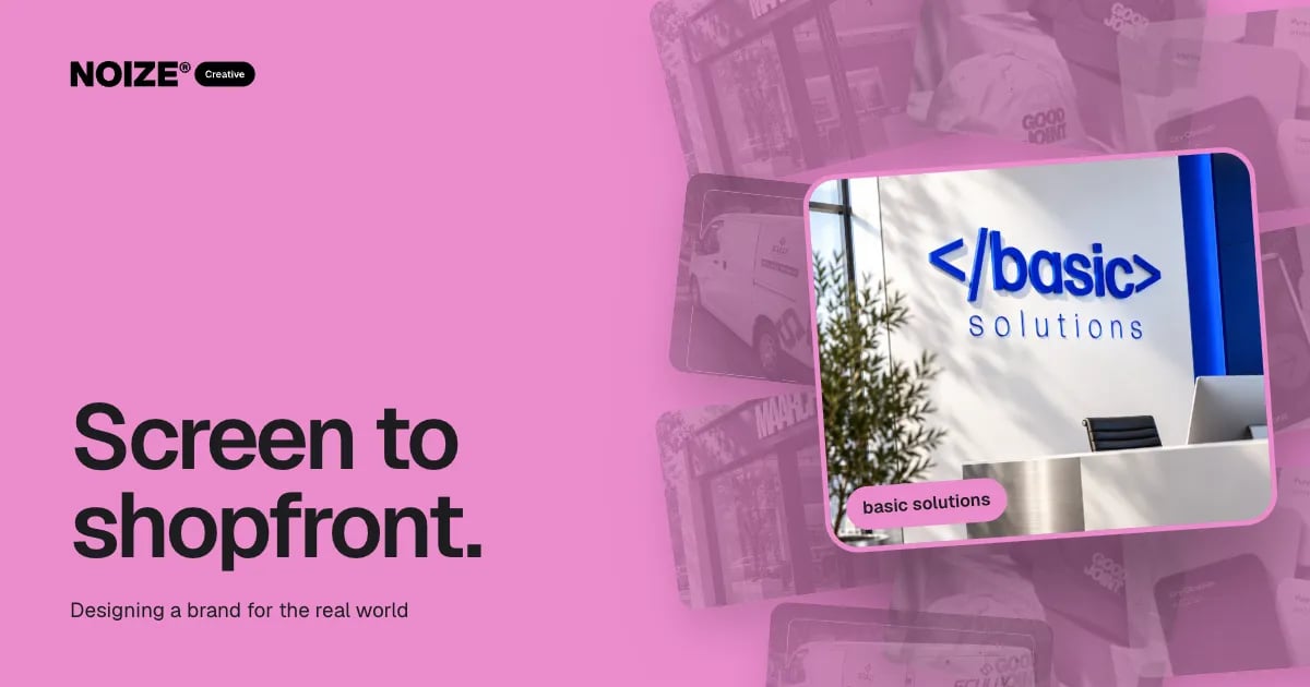
Most brands are designed on a screen, presented on a screen and approved on a screen. Then they meet the real world. The fine line in the logo disappears on a business card. The colour shifts on uncoated stock. The tagline is unreadable on a van at speed. The mark that looked elegant at laptop size turns to mush across a three-metre sign.
A brand that only works on screen is half a brand. Customers meet businesses on shopfronts, uniforms, packaging, vehicles and printed material, often before they ever see the website. The identity has to hold everywhere.
The short version
- Designing for the real world means testing a brand at every size, on every material and in every condition before it is signed off.
- That means simple, robust marks, colours specified for print as well as screen, type that reads at distance and a system that adapts to awkward formats.
- When Creative designs with Print involved from the start, the brand looks the same on a building as it does in the presentation.
Where screen-first brands break
01Detail that disappears
Thin lines, small text and intricate illustration vanish at small sizes and blur at large ones. A mark needs to work as a favicon and as a building sign.
02Colour that shifts
Screens display colour with light. Print reproduces it with ink on paper, vinyl, fabric or metal. A vivid screen colour can look dull or completely different in print unless it is specified properly for each process.
03Type that won't read
Light weights and tight spacing that look refined on a screen are illegible from across a street or on a moving vehicle.
04Layouts that don't adapt
A horizontal logo that works on a website header may not fit a narrow sign, an embroidered cap or a square social icon.
> I've seen businesses invest in a beautiful identity and then discover it couldn't be embroidered, couldn't be read on the van and printed brown instead of orange. Fixing those after launch is always more expensive than designing for them at the start.
How to design for the real world
- Test at extremes. Check the mark at its smallest and largest sizes before approving it.
- Specify colour for every process. Define screen, print and specialist colour values, and proof on the actual materials.
- Build variations. Create stacked, horizontal and icon versions so the brand fits any format.
- Check legibility at distance. Mock up signage and vehicles at real scale and view them as a customer would.
- Think about materials and finishes. Foil, embossing, matte stocks, fabric and acrylic all change how a brand reads. Choose deliberately.
- Mock up real applications. Shopfronts, uniforms, packaging, cards and vehicles, not just a logo on white.
“Exceeded our expectations in terms of quality, design and timeframe.”
Why Creative and Print work together
At NOIZE, Print is part of the design conversation, not the last step. Creative designs knowing the brand will be printed, stitched, wrapped and fabricated. Print advises on what each material can do and produces everything to one colour standard. The result is a brand that is consistent from the first business card to the largest sign, managed by one team.
An illustrative example
Imagine a property group rolling out a new identity across offices, signboards, cars and printed guides. Tested only on screen, the fine serif wordmark would fail on property boards viewed from a moving car. Designed with Print from the start, the system includes a bolder signage version, colour values matched to vinyl and board stock, and a simplified mark for embroidery. Every application looks intentional, and nothing needs reworking after launch.
The real-world checklist
Before approving a new identity, mock it up on the applications the business actually uses. A business card front and back. An email signature. A shopfront or office sign at real scale. A vehicle side panel. An embroidered polo or cap. A social profile icon. A piece of packaging or a printed brochure if they are relevant.
Look at each one at the distance and in the light a customer would. Ask whether the brand is still recognisable, still legible and still feels like the same business. Anything that fails is far cheaper to fix at the design stage than after the signs are made.
Why simplicity wins
The marks that hold up best in the real world are usually the simplest. Strong shapes, clear contrast and confident type survive reduction, distance, embroidery and weather. Detail is not banned, but it should live in places where people see it up close, such as packaging or stationery, rather than in the core mark that has to work everywhere.
Where to start this week
Print your current logo at business card size and at A3. Hold both at arm's length and across the room. If detail disappears or the colour looks wrong, the brand needs work before your next signage or print order. See creative.noize.com.au and print.noize.com.au.
Materials change the message
The same logo can feel completely different depending on what it is printed on. Foil on a dark card feels exclusive. A matte, uncoated stock feels natural and considered. Brushed metal signage feels permanent. Choosing materials is part of the brand decision, not just a production detail, and Print can show samples so the choice is made with the real thing in hand.
Planning for every location
For multi-site businesses, real-world testing has to account for different buildings, frontages and conditions. A sign that works on a city shopfront may not suit a suburban warehouse. Building a flexible signage system, with approved variations for different situations, keeps the brand consistent without forcing one design into every space.
Questions to ask before you start
Ask where the brand appears physically today. Ask which materials it is printed on. Ask how far away people see the signage. Ask whether the logo can be embroidered and engraved. Ask whether colours are defined for every print process. The answers show where the brand is at risk in the real world.
Related reading
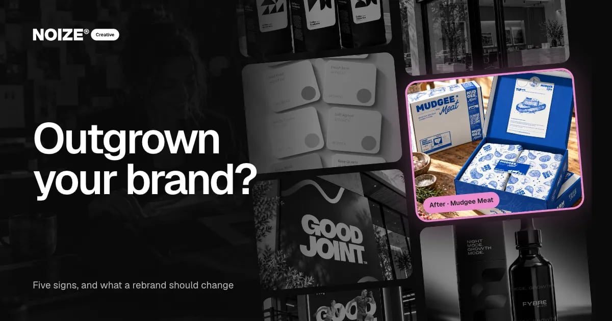
- Signs you have outgrown your brand, and what a rebrand should change
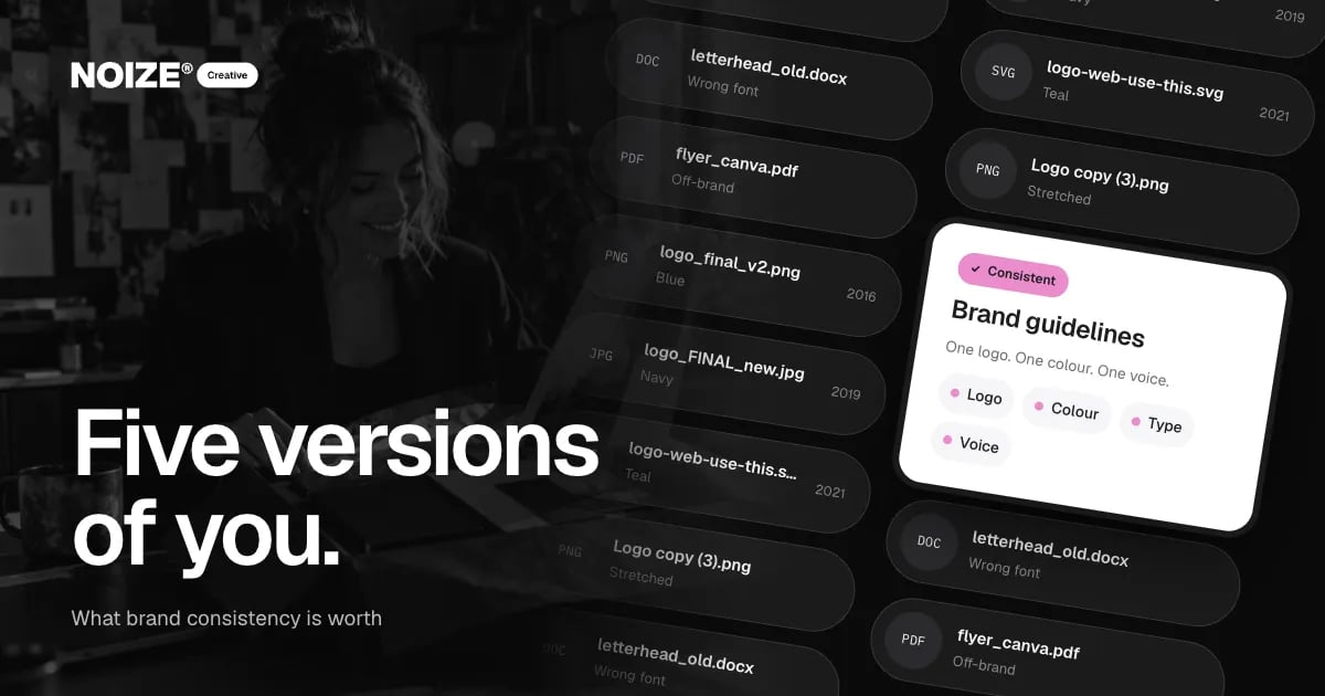
- What brand consistency is worth to a small business
Common questions
Why do my printed colours look different from the screen?
Screens and printing processes reproduce colour differently. Specifying colours properly for each process and proofing on real materials solves most of it.
What makes a logo work on signage?
Simple shapes, strong contrast, legible type at distance and a version suited to the sign's proportions.
Do I need different versions of my logo?
Usually yes: horizontal, stacked and icon versions so the brand fits every format.
Can you redesign a brand to work better in print?
Yes. Often a refinement of the existing mark solves the problems without a full rebrand.
Who manages production after the design?
NOIZE Print manages production across signage, packaging, uniforms, vehicles and print.
Can a logo be too detailed?
Yes. Fine detail often disappears at small sizes and blurs on signage. A simpler core mark with detailed elements used selectively usually works better.
Should signage use the full logo or just the icon?
It depends on the space and distance. A brand system with several approved versions lets each sign use the version that reads best.
Your first strategy conversation is on us.
Have a chatThe brand for business.